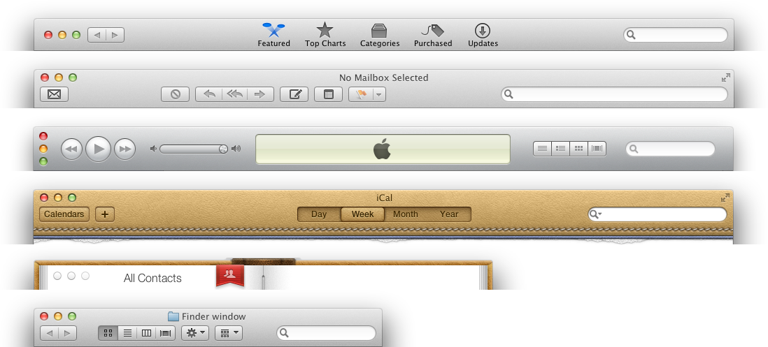
Lion adds more variety to windows


Giving a different texture or tint to windows of different applications may help you visually distinguish among them (as in the case of the new iCal), but varying position and appearence of the close/minimize/switch buttons and other controls doesn’t seem like a good idea. I wonder if this is what we’ll see in the final release.
Použití různých textur a barevných tónů pro okna různých aplikací vám je může pomoct rozlišit (jako v případě nového iCalu), ale měnit umístění a vzhled tlačítek pro zavření/minimalizaci/přepnutí a dalších ovládacích prvků mi nepřipadá jako dobrý nápad. Jsem zvědavý, jestli tohle uvidíme i ve finální verzi.
(Note: These are not screenshots that I have taken from my copy of the Developer Preview. You can find such images quite easily by googling for “iCal Lion”, “Mail Lion” etc. Some of them are even available at Apple.com. Although I do have access to Developer Preview of Mac OS X 10.7, I can’t probably even confirm that these images correspond to what I have seen without violating the NDA.)